From ordering food to streaming music and movies to staying connected to friends and family, the world is truly digital. An online presence is paramount, and having a website that effectively showcases your business is no longer a luxury but a necessity. As a business owner, your website serves as the virtual face of your company, often forming the first impression potential customers have of your brand. However, simply having a website is not enough; it needs to be designed with responsiveness in mind. In this blog post, we will delve into the significance of responsive website design and its crucial role in reaching and engaging your target audience.
Understanding Responsive Website Design
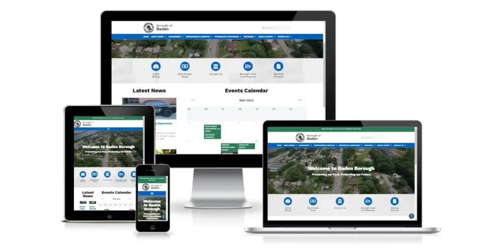
Responsive website design is a design approach that ensures your website layout, images, and other elements adapt seamlessly to various screen sizes and devices. With the diverse range of devices people use to access the internet, from desktop computers to smartphones and tablets, a responsive design is essential to provide a consistent and user-friendly experience. This is achieved through the implementation of fluid grids and flexible images, which adjust proportionally to the screen they’re viewed on. In essence, responsive design ensures that your website looks and functions optimally, regardless of the device being used.
The Mobile Revolution
The rise of mobile devices has revolutionized the way people access information and interact with websites. Statistics show that mobile internet usage has surpassed desktop usage, making it crucial for businesses to prioritize mobile-friendliness. Mobile-friendly websites not only cater to a vast audience but also enhance user experience.
With users often on the go, a website that loads quickly and provides easy navigation on their smartphones creates a positive impression and encourages them to explore further. Moreover, search engines have recognized the significance of mobile-friendly websites. Google’s mobile-first indexing means that Google primarily uses the mobile version of a website’s content for indexing and ranking. This shift underscores the search engine’s commitment to delivering the best user experience, rewarding websites that prioritize mobile optimization with higher search rankings.
Benefits for Business Owners
Improved User Experience:
User experience is at the heart of responsive design. When users visit your website, they expect a seamless and visually appealing experience, regardless of the device they use. A responsive design ensures that your content is easily readable and navigable, images are appropriately scaled, and buttons are touch-friendly on mobile screens. This leads to reduced bounce rates, increased time spent on your site, and ultimately, improved user engagement.
Increased Reach and Accessibility:
A responsive website expands your reach to a broader audience. With the proliferation of smartphones, people from all walks of life can access the internet. By catering to various devices, you ensure that your website is accessible to everyone, including those who rely on mobile devices as their primary means of online interaction. Additionally, a responsive design promotes inclusivity by accommodating users with disabilities, thereby enhancing your brand’s reputation for being considerate and user-focused.
Search Engine Optimization (SEO) Advantages:
Responsive website design and SEO go hand in hand. Search engines prioritize user experience, and a responsive design contributes to a positive user experience. Having a single URL for both desktop and mobile versions of your site consolidates your web presence, preventing duplicate content issues and ensuring that search engines accurately index your content. This simplifies SEO efforts, as you don’t need to manage separate SEO strategies for different versions of your website.
Cost-Effectiveness:
Investing in a responsive design can be cost-effective in the long run. Maintaining separate websites for desktop and mobile can be time-consuming and resource-intensive. With a responsive design, you maintain a single website that adapts to various devices, reducing the need for duplicate content creation and ongoing maintenance. This approach streamlines development efforts, saving you both time and money.
Best Practices for Responsive Website Design
Prioritize Mobile-First Approach:
When designing a responsive website, adopting a mobile-first approach is crucial. Start by identifying the most important content and features that should be prioritized on mobile devices. This approach encourages a focused design, ensuring that essential elements are accessible to mobile users without overwhelming them.
What’s the difference between adaptive and responsive website design?
Optimize Images and Media:
Images and media play a significant role in user engagement but can also impact loading times. Optimize images by compressing them without sacrificing quality. Additionally, use techniques like lazy loading to ensure that images load progressively as users scroll, enhancing the overall performance of your website.
User-Friendly Navigation:
Navigation is particularly important on smaller screens. Implement an intuitive and easy-to-use menu that collapses neatly into a mobile-friendly icon. Ensure that users can access all sections of your website without confusion or frustration.

Test Across Devices and Browsers:
Thorough testing is paramount in ensuring a seamless responsive experience. Test your website across various devices, browsers, and screen sizes to identify any glitches or inconsistencies in your responsive website design. This process helps you catch and address issues before they impact user experience.
Working with Professionals
While there are website-building tools available, working with professional web designers offers several advantages. Professionals bring a wealth of experience and expertise to the table, ensuring that your responsive design is not only functional but also aligns with your brand identity and business goals. Their ability to tailor responsive designs to suit your specific industry and target audience can set your business apart from the competition.
In a world where online interactions heavily influence consumer decisions, having a responsive website is a strategic imperative for businesses. By embracing responsive website design, you create a platform that seamlessly caters to users across devices, enhances user experience, improves search engine visibility, and optimizes costs. As a business owner, investing in responsive design is an investment in the future success of your brand in the digital realm. So, take the leap into responsive design, and watch your online presence flourish.
